Pocket CAGED
iPhone, iPad, Mac, Apple TV and Apple Watch App
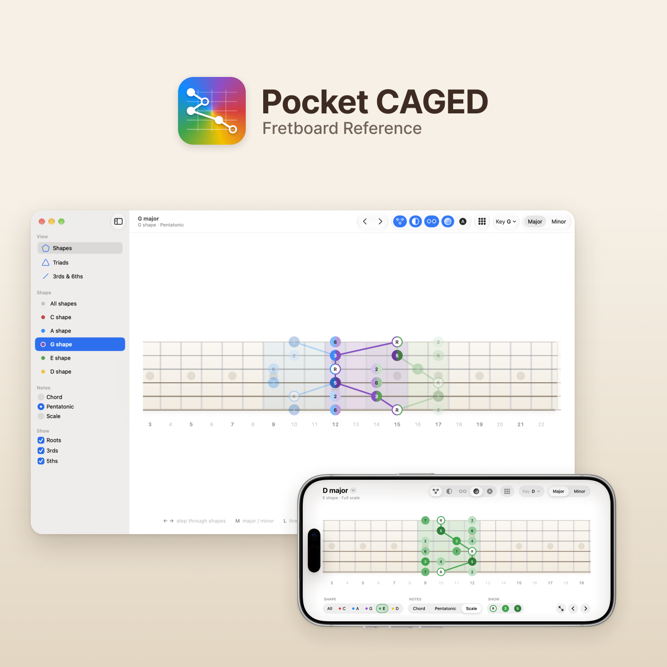
Services
Website
View on the App StoreI play guitar, and Pocket CAGED started at my own guitar. It's a fretboard reference for the CAGED system: every shape, in every key, on one fretboard. This is the long version, with every UI decision behind it.
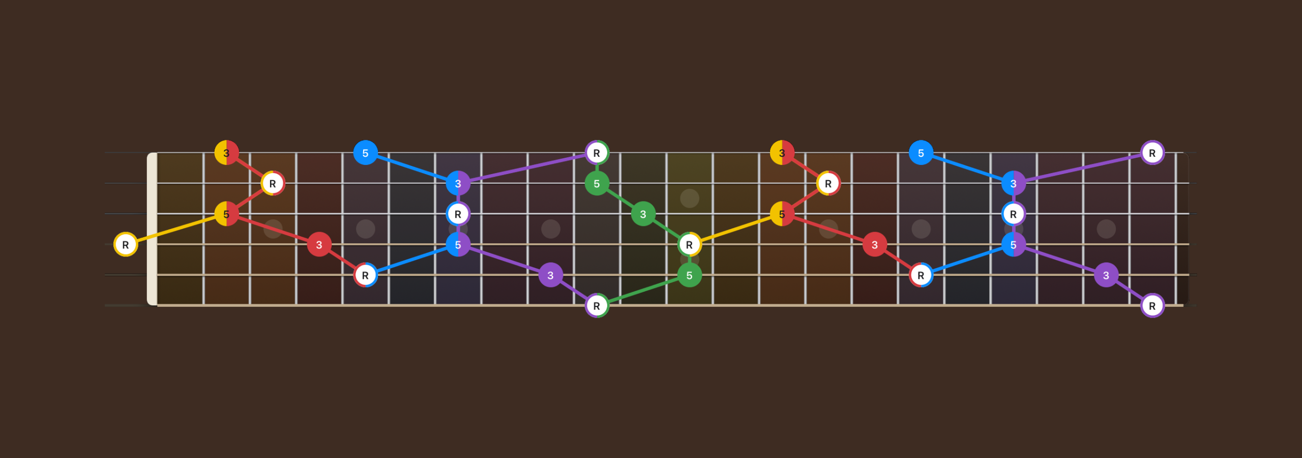
Five diagrams, one fretboard
The CAGED system splits the neck into five shapes: C, A, G, E and D. Lessons, books and videos draw each one on its own, so seeing how they join up meant flicking between pages and working it out in your head.
Pocket CAGED shows any shape in any key exactly where it sits on the neck, with the shapes either side and the notes they share. It isn't a lesson. It's the thing you keep open while you practise.
One app, six screens
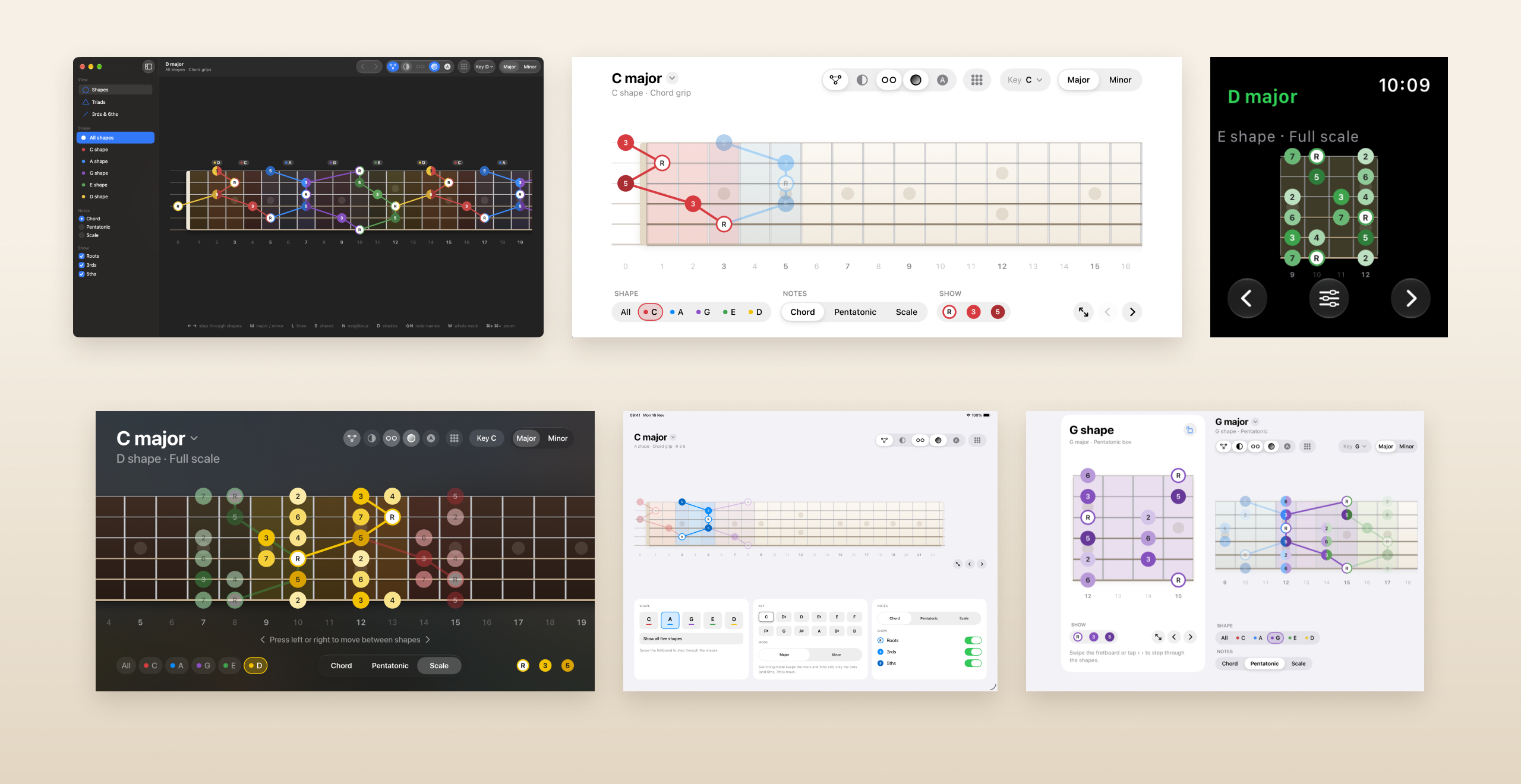
One SwiftUI codebase, laid out for each device: the same fretboard and the same shapes, with each screen's own controls.
- Mac: a sidebar, a toolbar and keyboard shortcuts.
- iPhone: landscape, with the controls underneath.
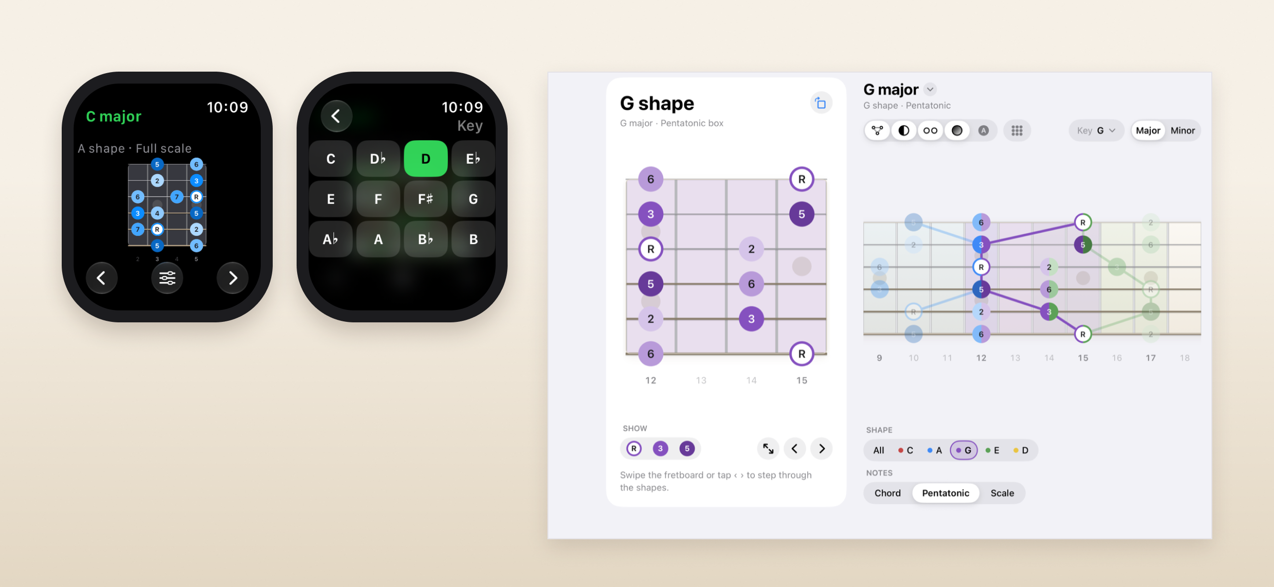
- Apple Watch: the shape as a chord chart.
- Apple TV: a ten-foot interface for the Siri Remote.
- iPad: a big board, with cards below.
- iPhone Duo: the shape beside the neck.
Three principles
Every decision went back to these three. When a design fought one of them, the design changed.
- Apple first. Each platform gets its own native controls, never a custom look-alike: segmented controls and switches on iPhone and iPad; a sidebar, radio buttons, checkboxes, a toolbar and shortcuts on Mac. SF Pro and SF Symbols throughout.
- Simple by default. The app opens on one chord shape: D major, E shape, with roots, 3rds and 5ths. Lines and Shared are on; Neighbour, Shades and Whole neck wait until you want them. Everything else is one tap away, and the app remembers what you turned on.
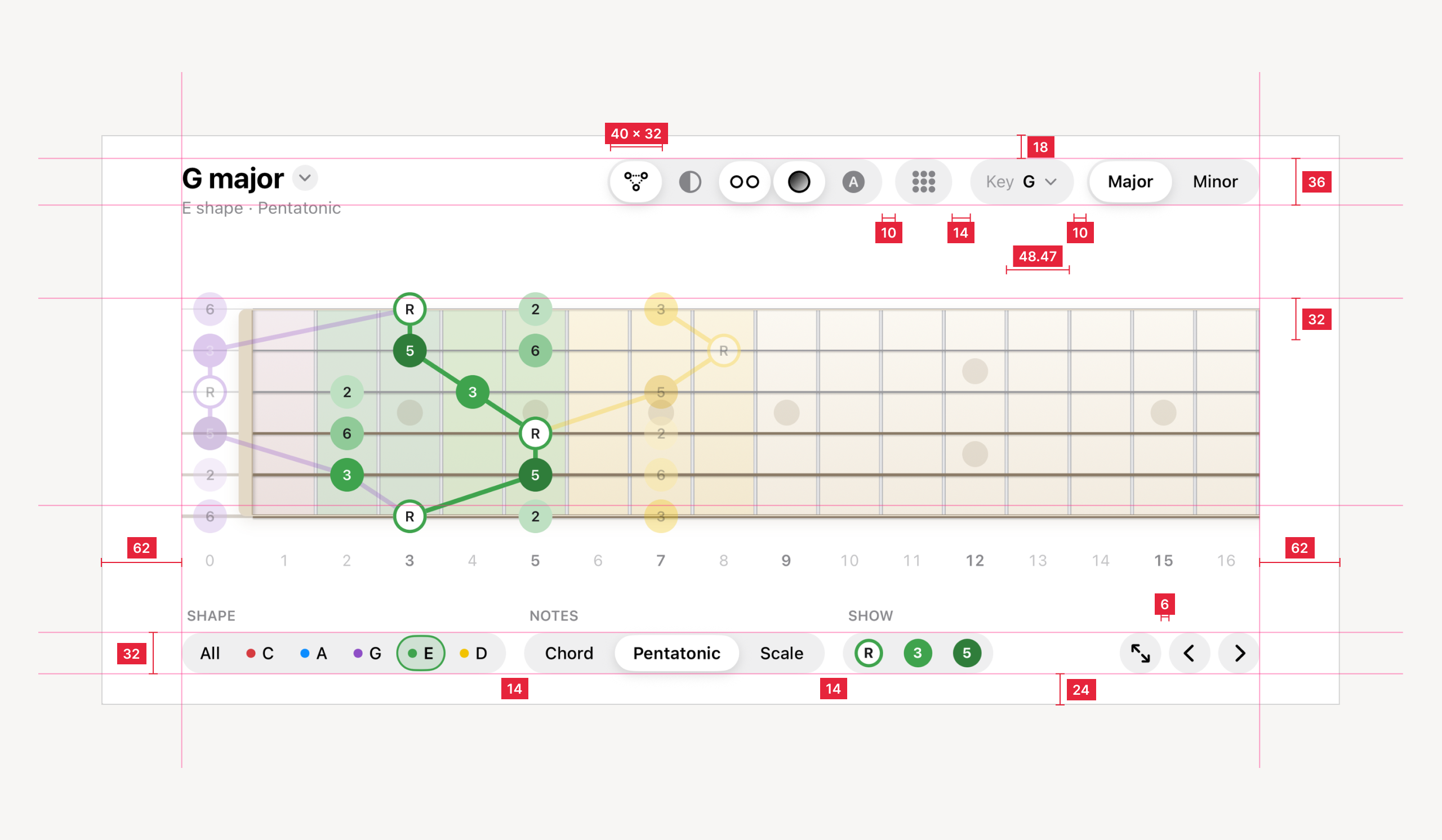
- One scale. Every fret is 48.47 pt wide and the strings are 32 pt apart, on iPhone, iPad and Mac alike. Smaller screens show fewer frets, and the neck slides under your finger.
Every measurement on the iPhone screen is set on purpose: 62 pt margins each side, 18 pt above the header, 36 pt header capsules with 40 × 32 pt display segments, 10 pt between buttons and 14 pt between groups, 32 pt tracks along the bottom and a 24 pt margin below them.
Anatomy of the fretboard
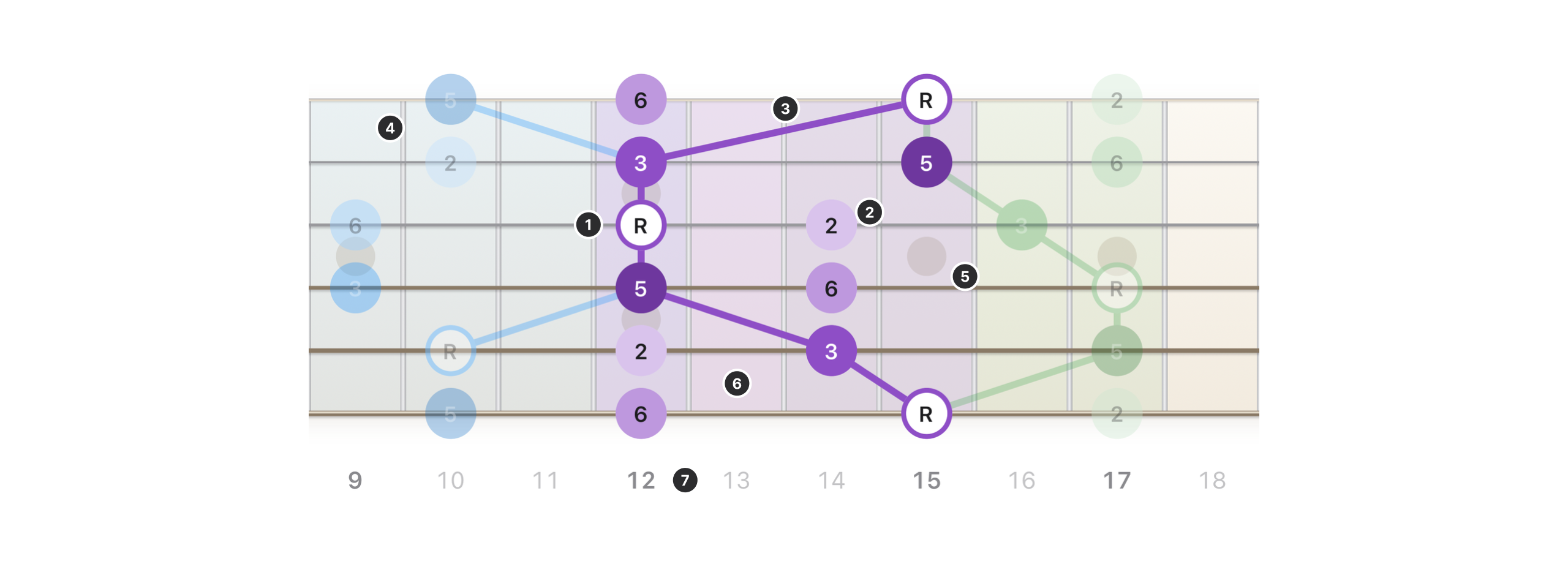
Everything on the neck carries meaning. Nothing is there for decoration.
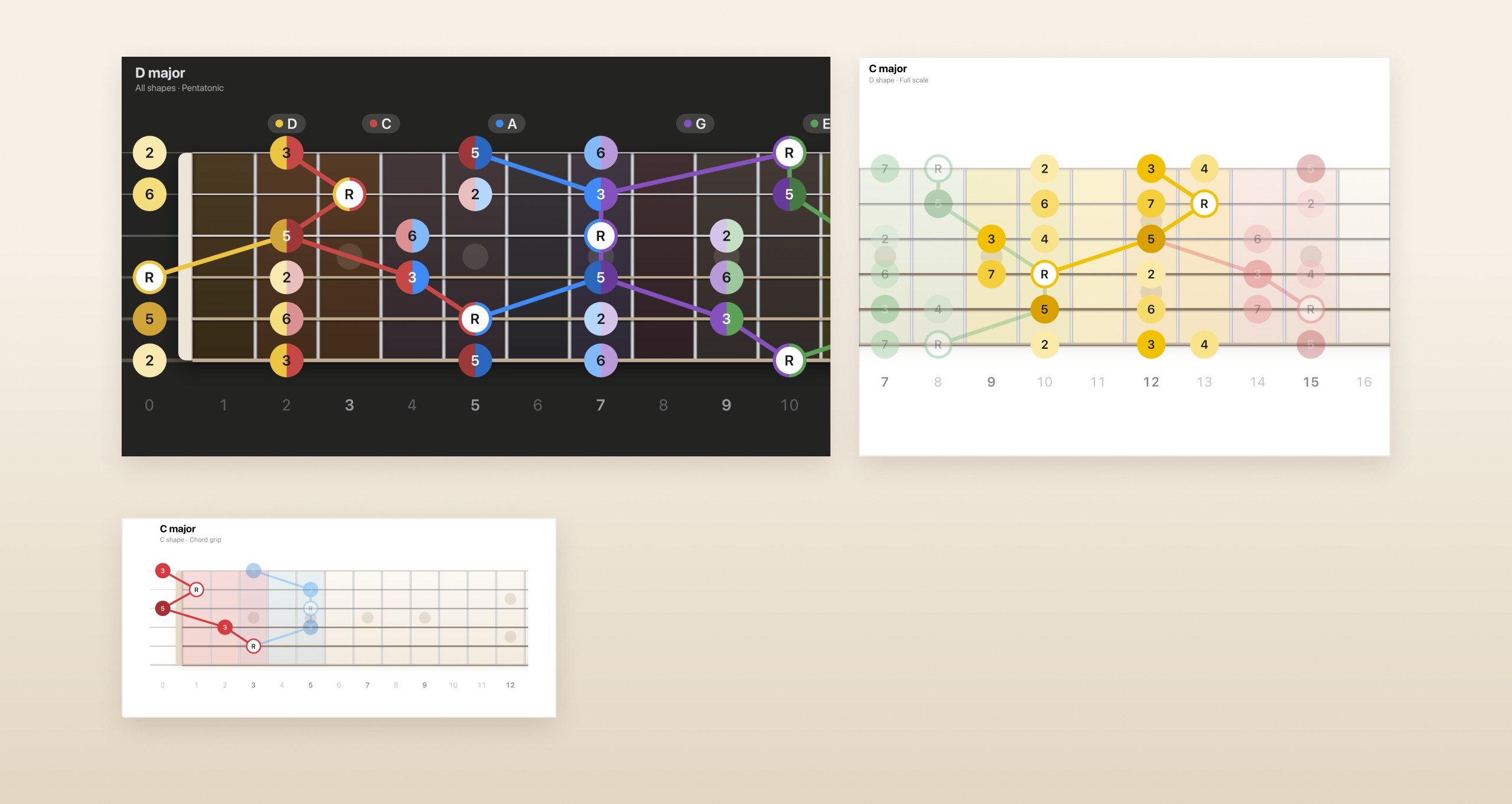
- Roots. A white dot ringed in the shape's colour, so the root is the first thing you see.
- Shades. The 3rd solid, the 5th deep, and the 2, 4, 6 and 7 pale. The colour tells you the note.
- Lines. Lines join the notes of the shape, so it reads as one grip or one box.
- Neighbour. The shapes either side fade in, so you can see where to move next.
- Fret markers. Inlays where a real neck has them, two at the 12th.
- The shape's frets. A soft band in the shape's colour marks the frets it covers.
- Fret numbers. Bold at the marker frets and light in between, like the dots on the side of a neck.
Where two shapes meet, a note belongs to both, so the dot splits into both colours. Dark mode swaps the maple for rosewood.
A colour for each shape
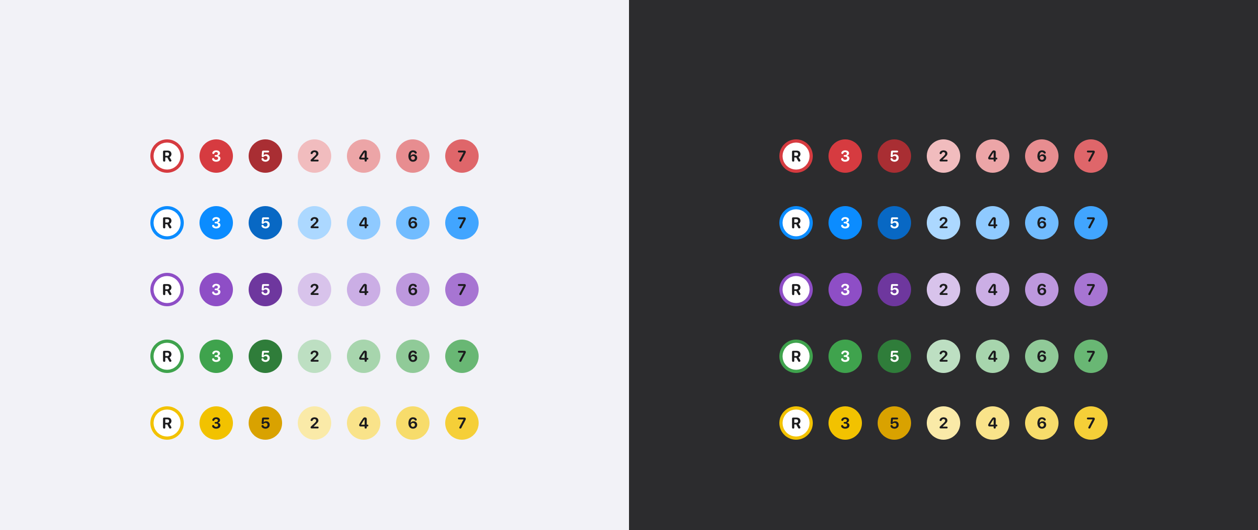
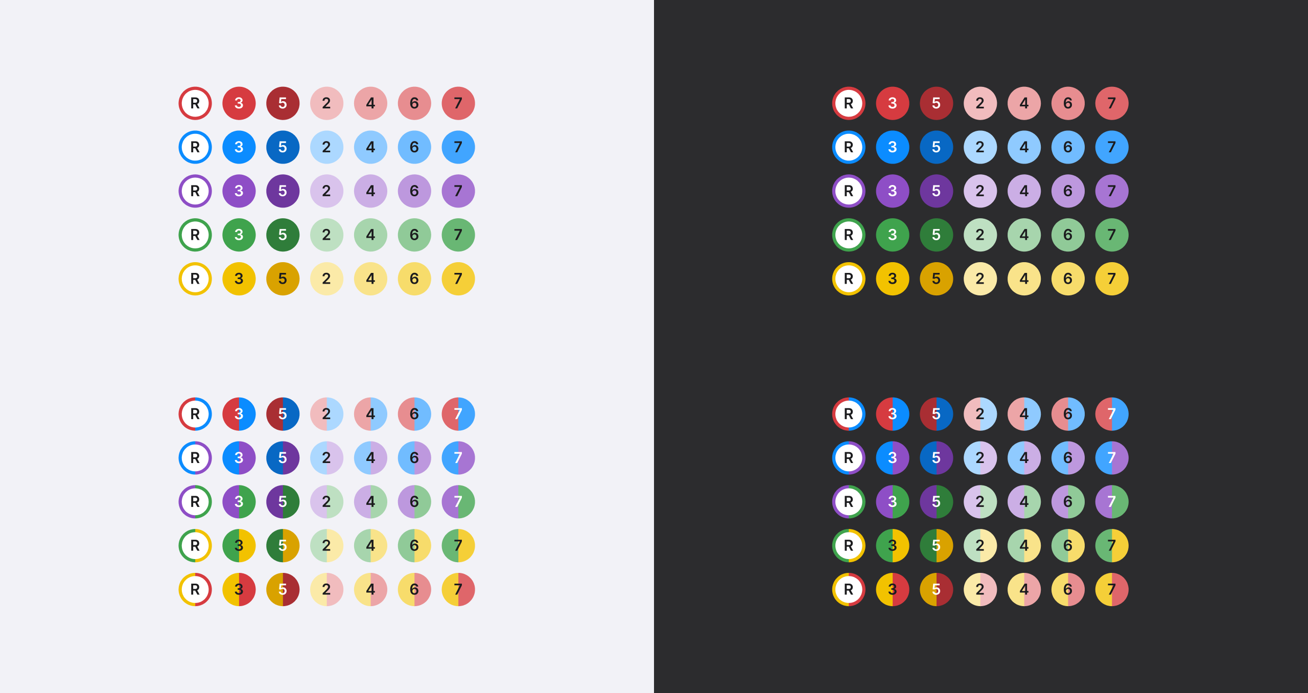
Five colours, one for each shape, in a solid, a deep and pale shades. The board changes between light and dark mode, but the shapes don't.
- C shape: red, #D63B40
- A shape: blue, #0B8CFF
- G shape: purple, #8E4EC6
- E shape: green, #3FA34D
- D shape: yellow, #F2C200
Each row runs root, 3rd and 5th, then the 2nd, 4th, 6th and 7th in pale shades.
Five shapes, five boxes
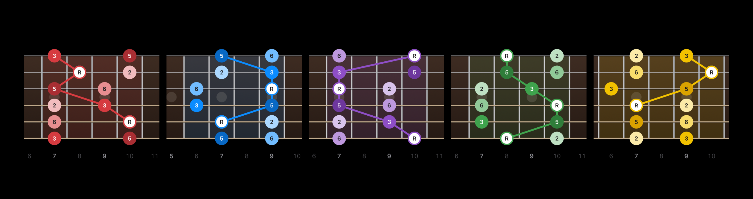
The pentatonic box of every shape, in dark mode, each in a key that puts it in the middle of the neck: the C shape in G major, the A shape in E, the G shape in D, the E shape in C and the D shape in A. Each box keeps its shape's colour, so you know which shape you're in at a glance, whatever the key.
The Shape picker: the main navigation
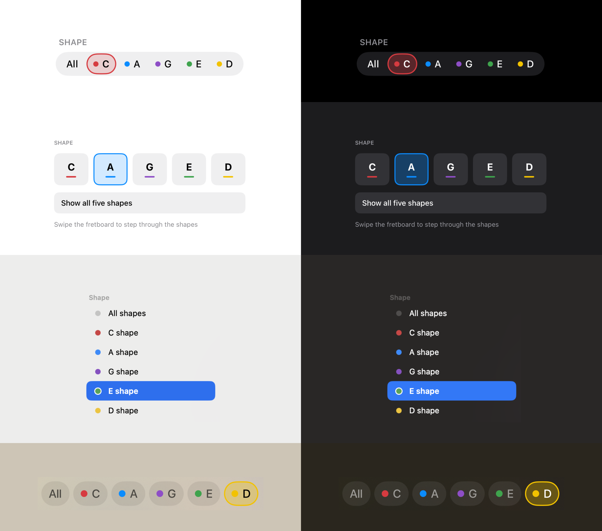
Choosing a shape is what you do most, so the Shape picker is the most important control in the app. Every screen shows the same five letters, C, A, G, E and D, each marked in its shape's colour, so the colours you learn on the neck are the ones you tap.
- iPhone: one capsule track along the bottom: All, then the five shapes, each with a dot in its colour. The chosen shape is outlined and tinted in its own colour.
- iPad: a Shape card of five big buttons, each underlined in its colour, with Show all five shapes beneath.
- Mac: the Shape section of the sidebar, a native list with a coloured dot on every row and the system's own selection.
- Apple TV: a row of chips under the neck, readable from the sofa, the chosen one outlined in its colour.
- Light and dark: the controls follow the system, but the shape colours never change. G is always purple.
Text on colour, decided dot by dot
Every figure sits on a coloured dot, and white or dark text has to read on every one of them. I reviewed all 60 combinations of shape colour, shade and shared pair side by side, in light and dark mode, then locked the table.
- Roots: a dark R on a white dot, ringed in the shape's colour.
- Solid and deep: white on red, blue, purple and green. Dark on yellow, where white would vanish.
- Pale shades: dark on the 2, 4, 6 and 7. One exception: a shared 7 with no yellow half is deep enough for white.
- Shared notes: each half keeps its shape's colour. White on the solids and deeps, unless one half is bright yellow.
- Locked: every cell has a test in the app's code, so a later change can't quietly break one.
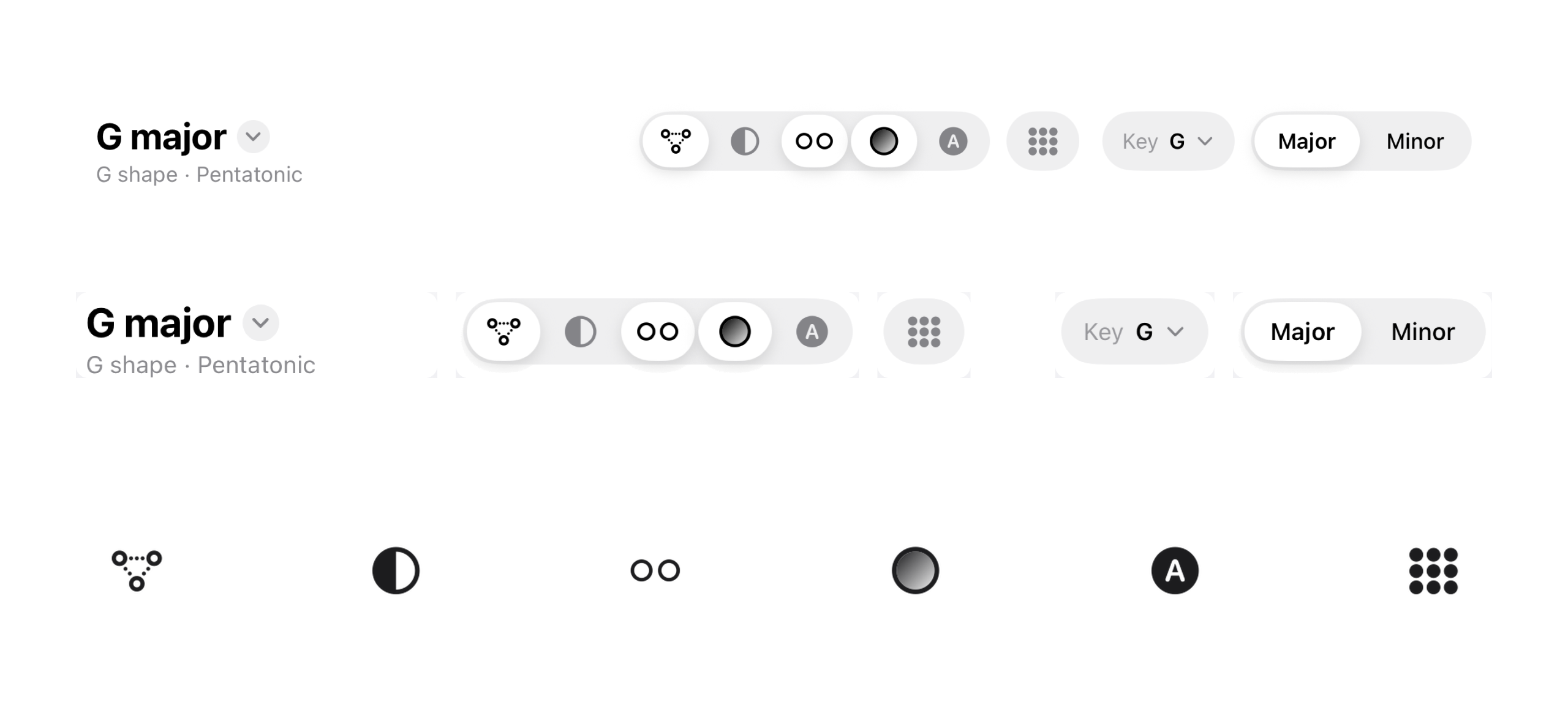
The header, pulled apart
One row, one height. Every capsule is 36 pt tall on iPhone, so the controls read as a single line.
- Title: a menu of the views: Shapes, Triads, and 3rds & 6ths.
- Display buttons: 40 × 32 pt segments in one track, with a 2 pt inset.
- Whole neck: on its own, because it's about the neck, not the shape.
- Key: a menu of all 12 keys, 36 pt tall.
- Major / Minor: my own track, because Apple's only comes in 31 or 48 pt.
The spacing is 10 pt between buttons, 14 pt between groups and 16 pt before the title. The six display buttons are Lines, Shared, Neighbour, Shades, Note Names and Whole neck.
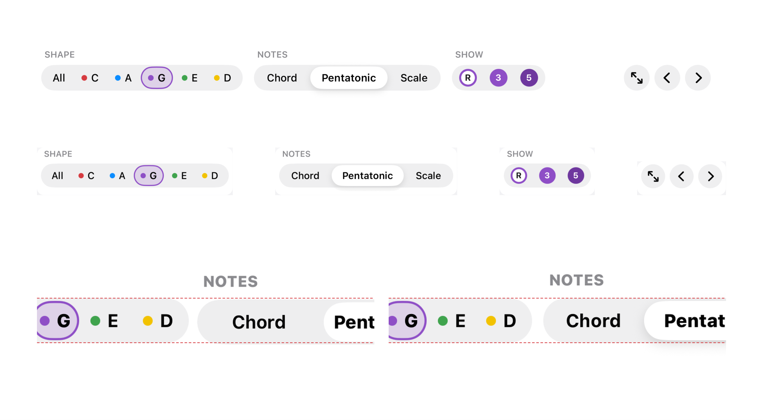
The bottom row, pulled apart
Shape, Notes and Show share one 32 pt track design, with Full Screen and the arrows beside them.
- Shape: extra room at the round ends keeps All and D clear of the curve, and every highlight is the same size.
- Notes: my own track, with the same height and thumb as Shape.
- Show: the R, 3 and 5 dots are the buttons, in the shape's colour.
- Full Screen and the arrows: 32 pt circles. When space runs out the arrows go first; Full Screen stays.
Before, Apple's segmented control sat beside my own tracks, a point lower than Shape and Show, so both its edges missed the guides. Now one component, SegmentChoice, draws Notes, Strings, Interval and Major/Minor at one height, so every edge sits on the same line.
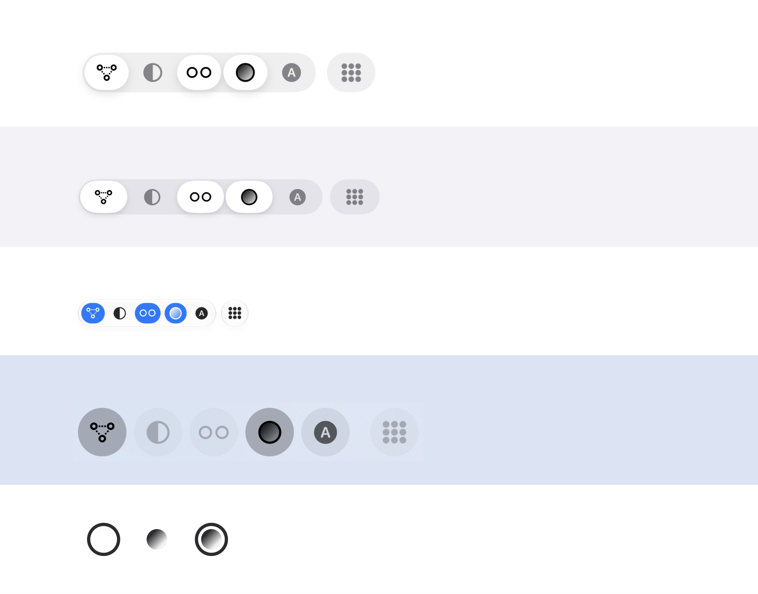
One icon family, every screen
Six display buttons, drawn the same way on iPhone, iPad, Mac and Apple TV, each in that platform's own style.
- Built on Apple's circle. Shades is my own SF Symbol, drawn on the ring of Apple's own circle symbols, so it sizes and weighs exactly like the Apple icons beside it, from Ultralight to Black.
- Two layers for Shades. The ring is one layer and the dot another. The app fades the dot from full to faint, so the icon shows what the button does.
- One font sizes them all. Every icon takes the same text style, so the row stays even at any text size or with Bold Text.
Top to bottom: iPhone at 40 × 32 pt with 17 pt icons, iPad at 64 × 44 pt with 22 pt icons, the Mac toolbar's own buttons tinted when on, and Apple TV's round 66 pt chips. Last, the Shades icon: a ring plus a fading dot.
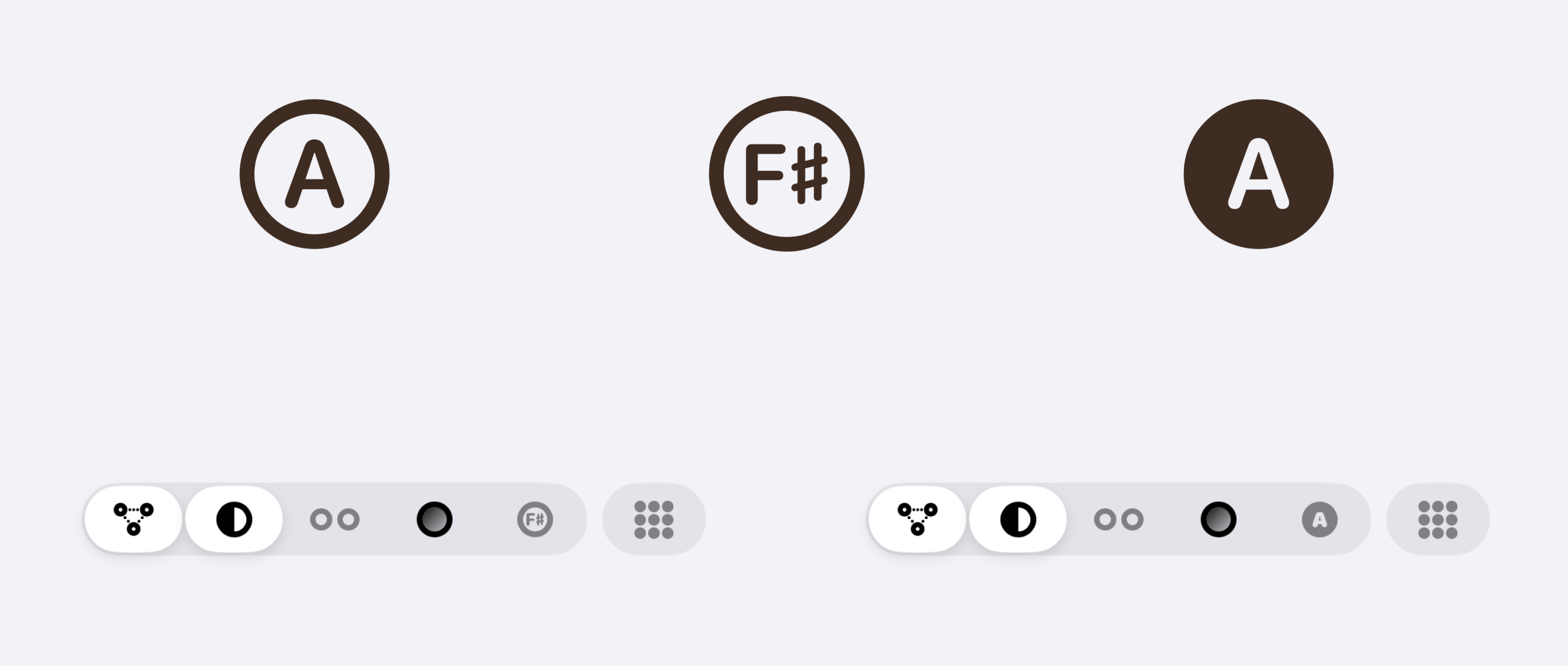
Note Names, three tries
The button that puts each note's name on the dots took three designs to find one that reads at a glance, at any weight.
- A in a ring. Apple's own a.circle. Clear, but it read as a pen nib, not a note.
- F♯ in a ring. My own symbol on Apple's ring, with F♯ in SF Pro Rounded and its weight matched to Apple's F. A note at a glance, until Bold Text made the ring heavy and the F♯ small.
- A in a filled dot. Apple's a.circle.fill: a note dot with its name on it, filled like Shared and Whole neck. Clear at every weight, and the one that shipped.
With Bold Text on, the F♯ ring was the heaviest in the row, with the smallest letters. The filled A sits with the filled Shared and Whole neck icons.
The sides are the notes
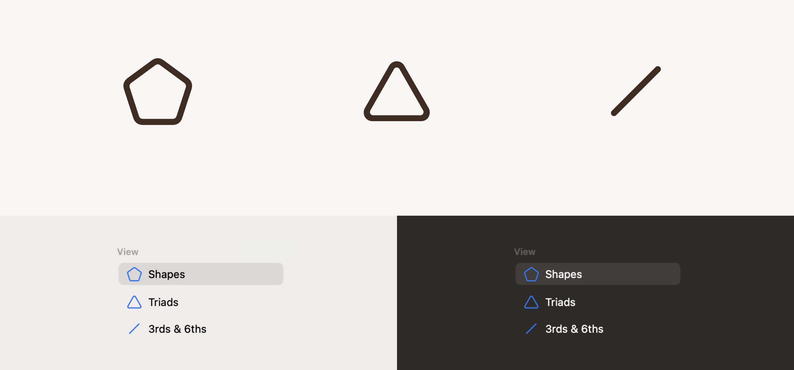
Each pack has its own icon, and its shape says what it shows. A pentagon for Shapes: five sides for the five CAGED shapes. A triangle for Triads: three notes, the root, 3rd and 5th. A single line for 3rds & 6ths: two notes, joined.
On the Mac they head the sidebar, in a View section above Shape. On iPhone and iPad the title is a menu of the views, with the same icons. All three are Apple's own SF Symbols at one outline weight, tinted like the system's.
An earlier version used two circles for Shapes, the same as Neighbour, and arrows for 3rds & 6ths that didn't say anything. Counting sides fixed both.
Sizing for real eyes
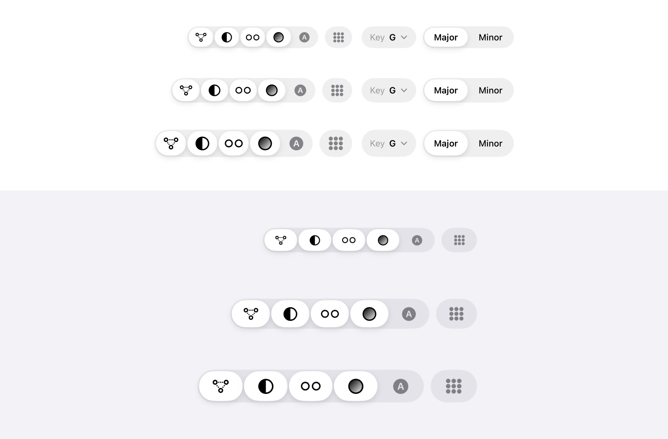
I proofed the header icons at three sizes from real trial builds, on the narrowest iPhone and iPad as well as the biggest. On iPhone I tried 15 pt icons in 36 × 28 pt buttons, 17 pt in 40 × 32 and 20 pt in 44 × 36, and chose 17 pt. On iPad I tried 15 pt in 48 × 32, 20 pt in 56 × 40 and 22 pt in 64 × 44, and chose 22 pt, Apple's 44 pt touch height.
At the largest text sizes each control grew by a different amount and the rows broke. Now the iPhone controls stay at their designed size, and a long press shows any of them big.
Built for every reader
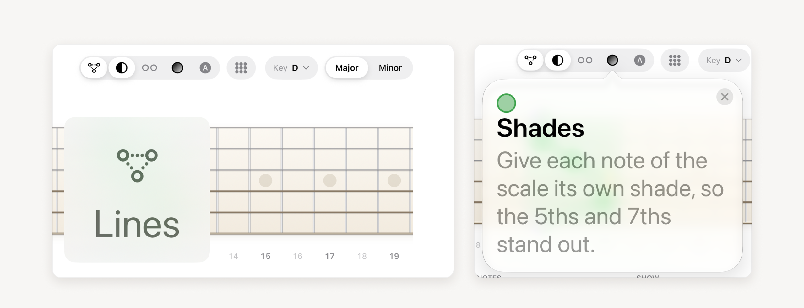
I checked text size, Bold Text, VoiceOver and Reduce Motion on real builds at the extremes, not just the defaults.
- Text size: labels and tips follow the reader's text size. The iPhone control rows hold their designed size so they never break.
- Bold Text: every icon takes the bold weight, my own Shades symbol too. It's one reason the F♯ Note Names icon went.
- VoiceOver: every button has a name. On iPad each Show row reads as a single switch.
- Reduce Motion: on Apple Watch the shapes fade from one to the next instead of sliding.
Full Screen: just the fretboard
For practising with the guitar in your hands: every control goes and the neck fills the screen.
- About ten frets across: the shape and both its neighbours, as big as the height allows.
- The caption grows with the screen, at a fiftieth of its width: 22 pt on iPhone, 51 pt on a 27-inch display.
- The wood itself is centred, with the caption's room left at the top and the same at the bottom.
- Swiping still steps through the shapes. Apple TV and Apple Watch were already just the fretboard.
On Mac it's the window's own Full Screen; on iPad and iPhone, a button or a pinch.
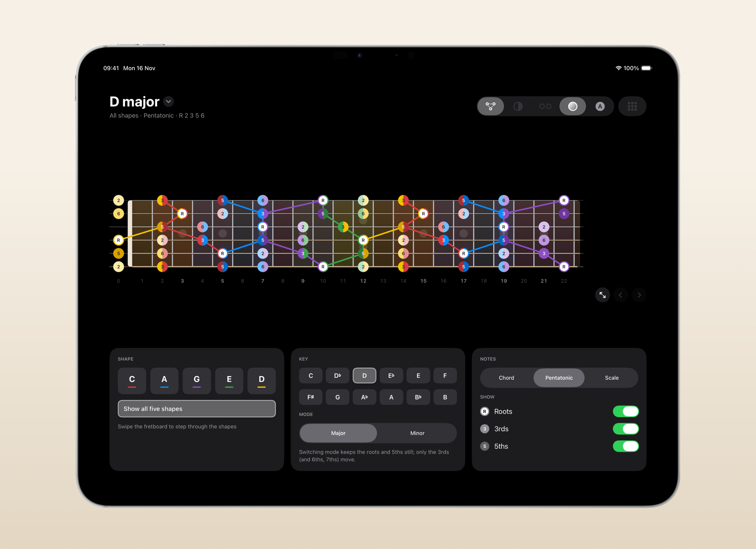
iPad: the neck, then the cards
A big board on top and grouped cards below: the iPad's own layout, not a stretched iPhone.
- The whole row is the switch. I kept trying to tap the R, 3 and 5 dots to turn them on, so the dot, the name and the switch became one tap target. VoiceOver still reads each row as one switch.
- The wood, halfway. The neck's wood sits halfway between the header and the cards, worked out from the layout's own measurements at any text size. It sat 28 pt high until I spotted it.
- Cards that reflow. Three cards across in a wide window. In portrait, on iPad mini and in narrower windows, Shape and Key sit side by side, then Notes.
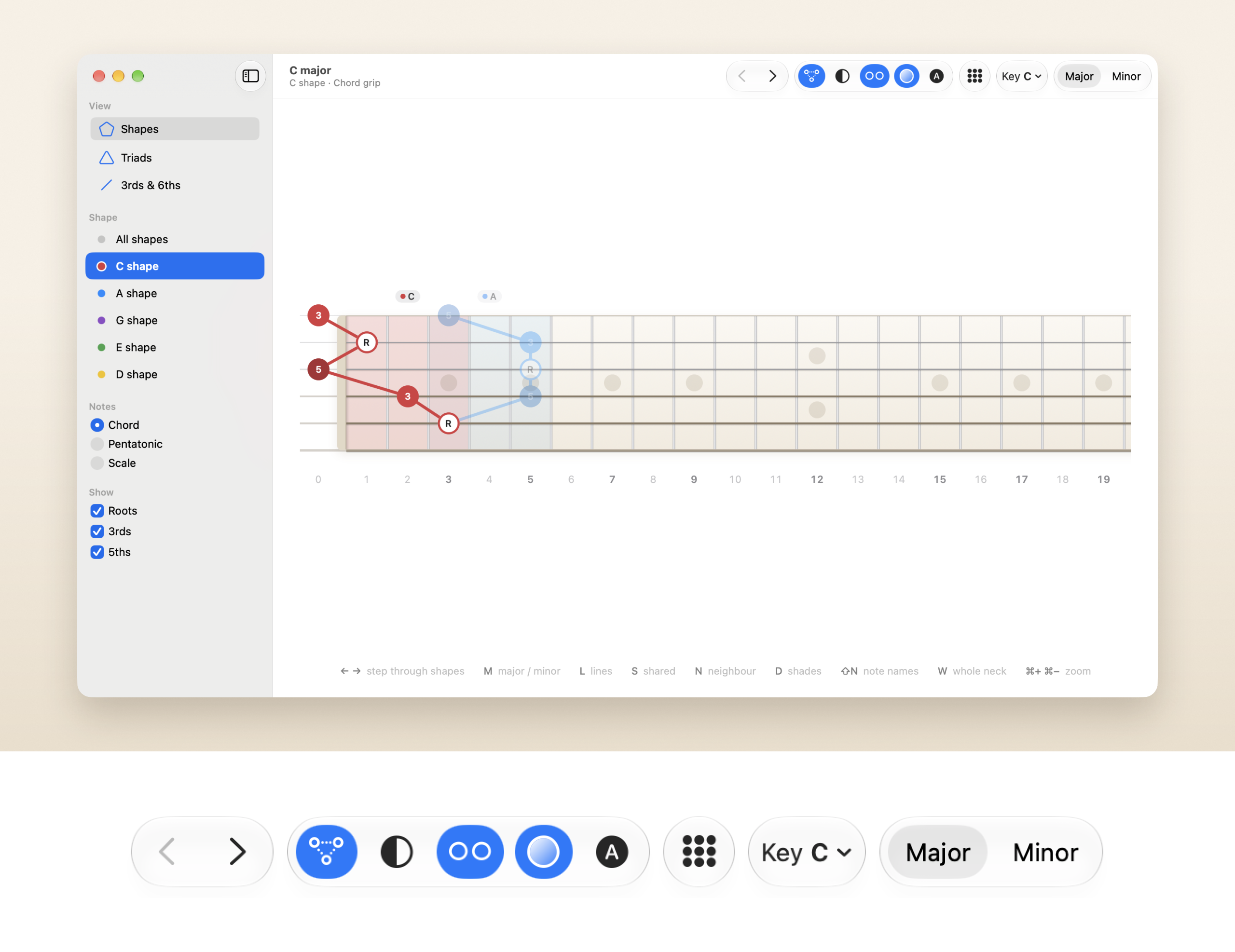
Mac: a Mac app, not an iPad one
A sidebar, a toolbar, menus and a shortcut for everything, so you can play with one hand and drive with the other. The toolbar keeps the same order as iPhone and iPad: arrows, display buttons, Whole neck, the Key menu and Major/Minor.
- ← →: Step through the shapes
- ⌘1, ⌘2, ⌘3: Shapes, Triads, 3rds & 6ths
- M: Major or minor
- L: Lines
- S: Shared
- N: Neighbour
- D: Shades
- ⇧N: Note Names
- W: Whole neck
- ⌘+, ⌘−, ⌘0: Zoom in, zoom out, actual size
- ⌃⌘F: Full Screen (Esc to leave)
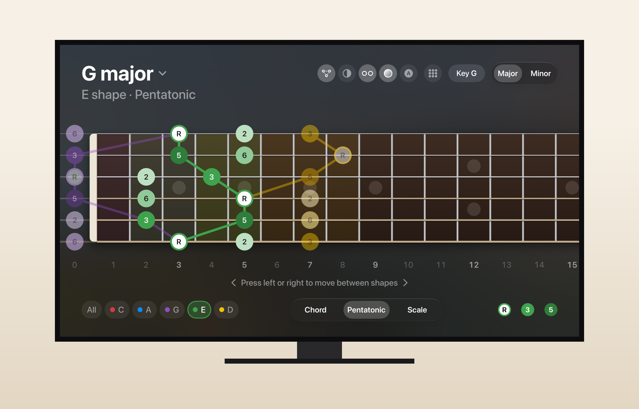
Apple TV: read from the sofa
The iPhone's layout at ten feet, driven by the Siri Remote and tuned from videos of the app on my own TV.
- Press, not swipe. The neck has focus at launch. Left and right step through the shapes, and every remote can press, even one set to clicks only.
- The neck never moves. Fixed heights above and below it, so a focused chip lifting or a longer subtitle can't nudge the fretboard.
- Edge to edge. The neck runs past the safe area at 2.5 times its iPhone size, off both sides of the screen.
- Ready for overscan. One fixed row of 66 pt icon chips fits every TV, even one set up for overscan, so nothing jumps between layouts.
- The end of the neck. The "press left or right" arrow fades when there's no further shape that way.
Apple Watch and iPhone Duo
Two screens with their own shapes: one taller than it is wide, and one with room for the shape beside the neck.
- A chord chart, not a neck. The watch screen is taller than it is wide, so the shape stands up like a chord chart, with the frets numbered down the side.
- The Digital Crown. Each detent steps one shape along the neck; the arrows and a swipe do the same. With Reduce Motion the shapes fade instead of sliding.
- Settings, the watch way. A native list from the middle button, and the twelve keys in a grid.
- iPhone Duo. The shape is big in a card on the left, turned like a chord chart if you like, with the sliding neck at the standard scale on the right.
The brand on one board
The icon, colours, type and note dots on one page, in the app's own maple and rosewood.
- Logo: the app icon, the C shape on a wheel of the five shape colours, with the wordmark in Inter Bold, in rosewood.
- Colour: a solid and a deep for each shape: C #D63B40 and #A92E33, A #0B8CFF and #0868C4, G #8E4EC6 and #6E379E, E #3FA34D and #2F7D3A, D #F2C200 and #D9A200. The board is maple (#FBF8F2) in light mode and rosewood (#3E2C22) in dark mode.
- Type: SF Pro and SF Symbols inside the app, Inter for the website and marketing.
- Note dots: the root ringed in the shape's colour, the 3rd solid, the 5th deep and the rest pale. A shared note splits into both colours.

On the App Store
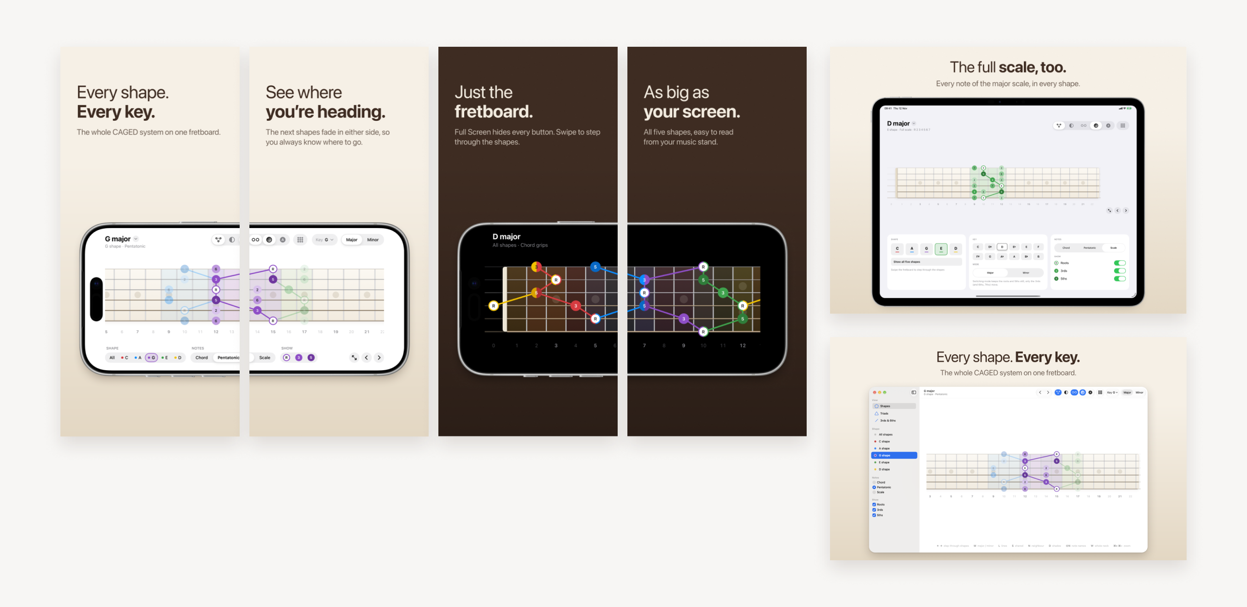
Screenshots are captured from the real app for every device and rebuilt with each release, so they never show an old interface. Every headline has two weights, a light lead-in and a bold key phrase: "Every shape. Every key." The iPhone shots pair up into one wide picture as you scroll.
As the product and UI/UX designer, I took Pocket CAGED from the music model through interaction design, the icon and App Store artwork, to development in SwiftUI. It's free, with no ads and no account. Minor CAGED is a one-time in-app purchase.
