BenchWork
iPhone and iPad App
Services
Website
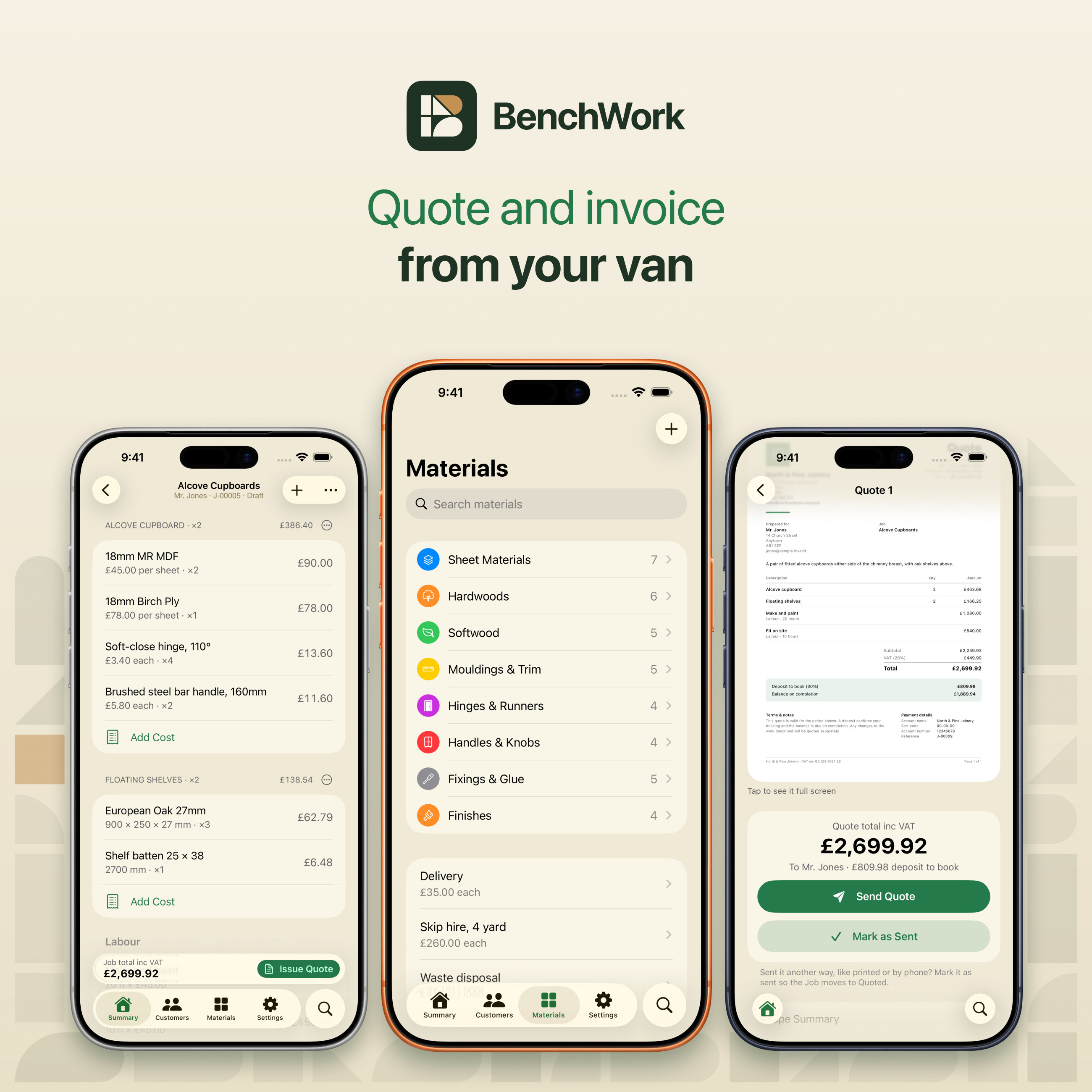
View on the App StoreBenchWork started with a problem in the trades: jobs are priced on site, but quotes and invoices get written up at the kitchen table at night. It lets joiners and carpenters quote and invoice from the van. This is the long version, from the first screen to the brand.
Quotes written at the kitchen table
Joiners, carpenters and anyone who works with wood price jobs on site, then spend their evenings turning notes into quotes and invoices.
BenchWork keeps your materials and costs on your phone, so a quote takes minutes and goes out before you drive off. When the job is done, the quote becomes the invoice.
Simple on the surface
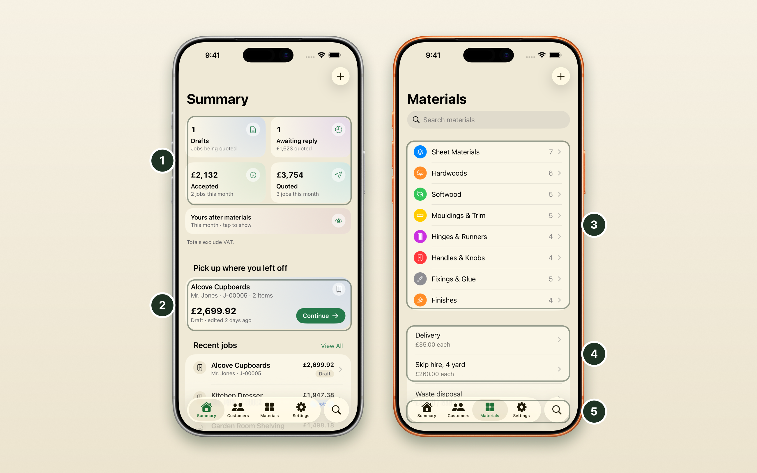
Standard iOS everywhere it matters, with one custom screen for the overview. People should be able to organise things their own way.
- One custom screen. The home screen is the only bespoke design: drafts, quotes waiting for a reply and accepted work at a glance.
- Back to work in one tap. The last job you touched is waiting at the top.
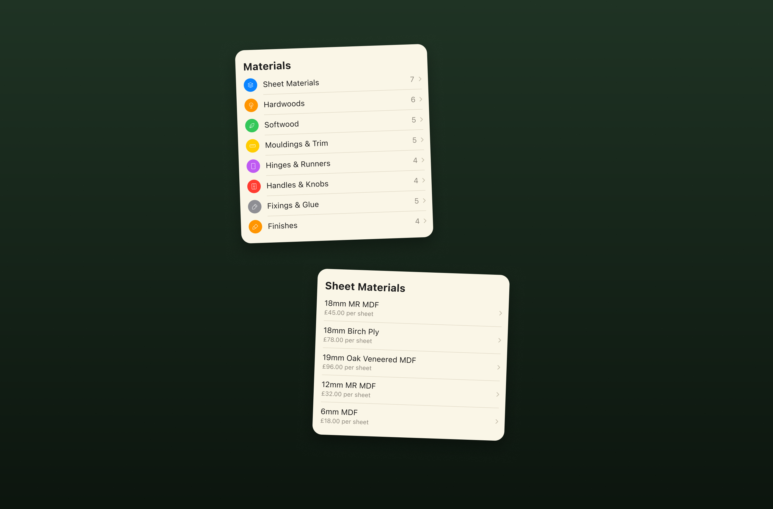
- Your own folders. No fixed categories. People make their own material folders, each with an icon and a colour.
- Costs set once. Every item keeps its own cost and unit, ready to drop into any quote.
- Familiar from the first tap. The tab bar, lists and controls are standard iOS everywhere else.
Price it, then build the job
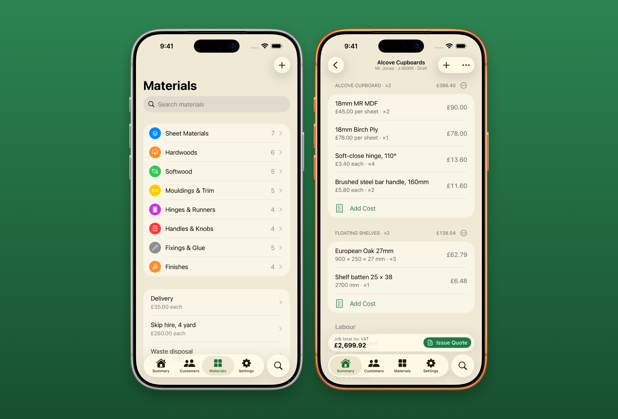
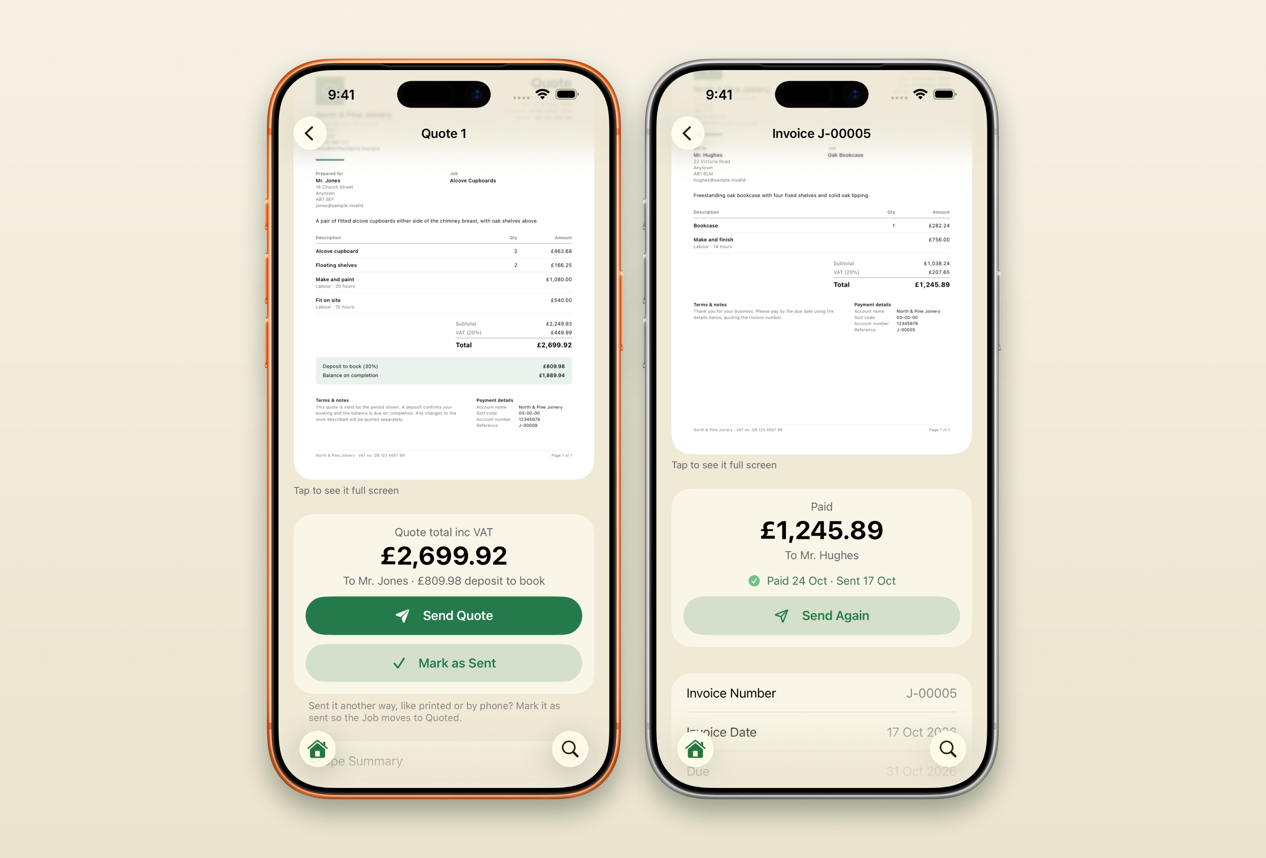
Your materials and costs are saved once. Each job is built from them in a few taps, with the total worked out as you go.
Send the quote, then get paid
The quote goes out as a tidy PDF. When the job is done, it becomes the invoice, and you mark it paid.
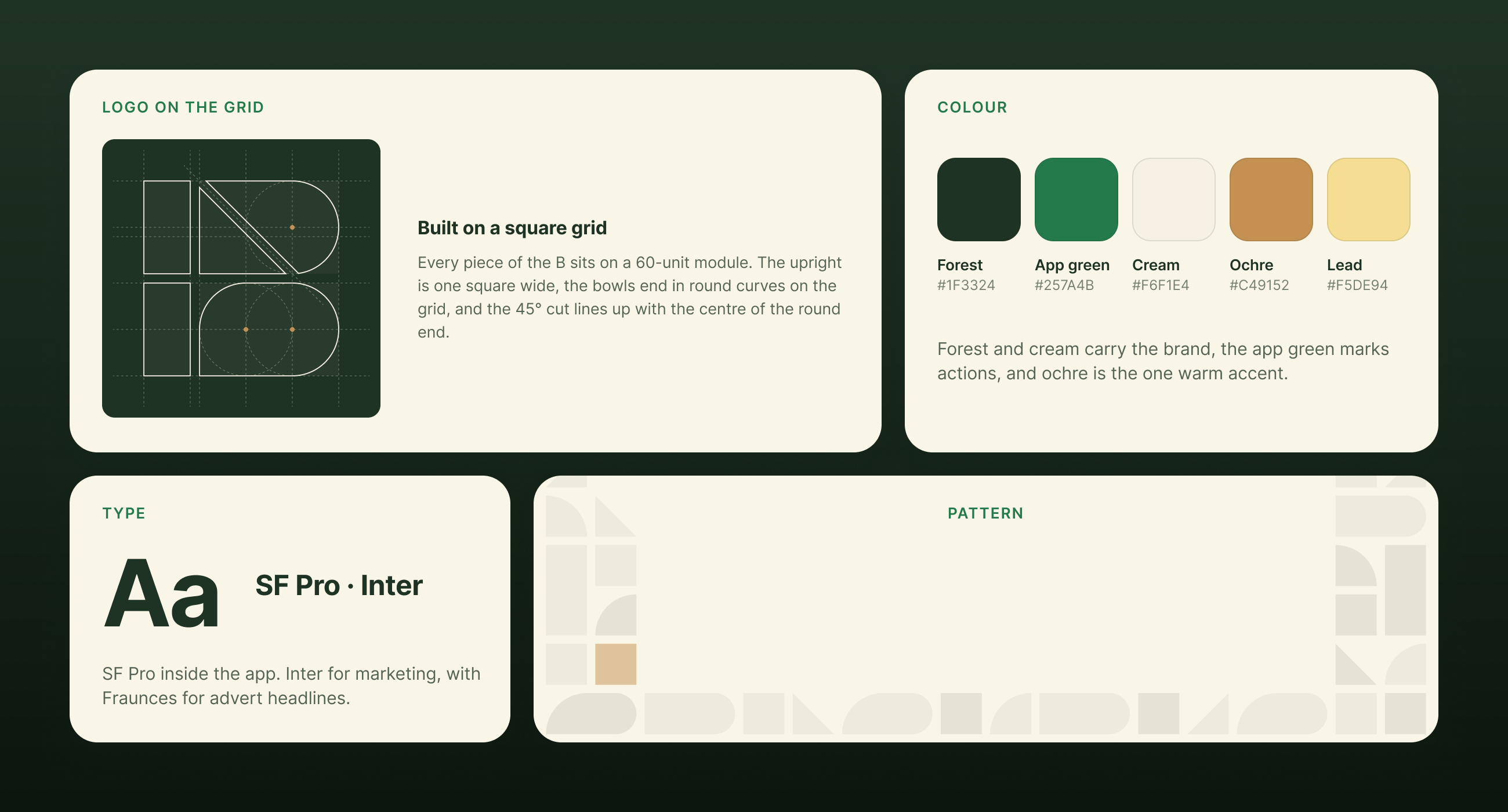
A brand built from one shape
The B monogram is drawn on a square grid, and its pieces become the pattern used across the marketing.
- The grid: every piece of the B sits on a 60-unit module. The upright is one square wide, the bowls end in round curves on the grid, and the 45° cut lines up with the centre of the round end.
- Type: SF Pro inside the app, Inter for marketing, and Fraunces for advert headlines.
- Colour: forest #1F3324 and cream #F6F1E4 carry the brand, app green #257A4B marks actions, and ochre #C49152 is the one warm accent, with lead #F5DE94.
- Pattern: the pieces of the B, laid out as tiles.
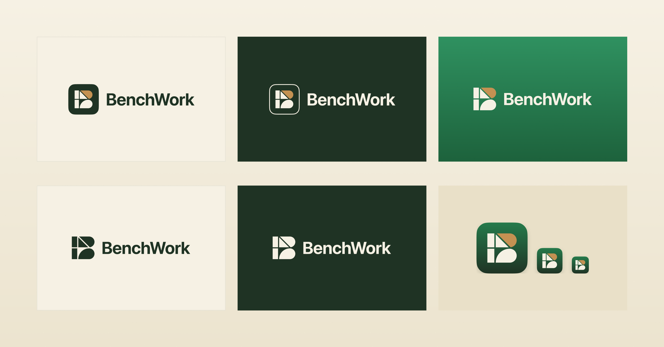
One mark, every background
Positive, negative and single-colour versions, plus the app icon, so the B holds up wherever it appears.
- Top row: primary on cream, negative on forest, and on app green.
- Bottom row: one colour dark, one colour light, and the app icon at three sizes.
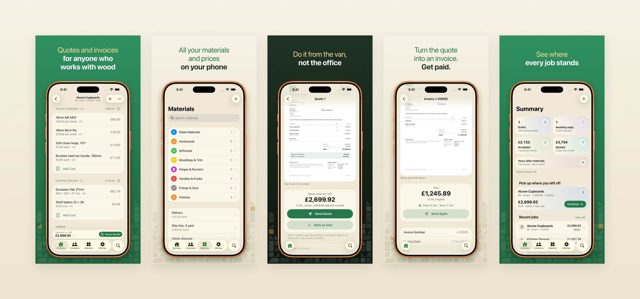
On the App Store
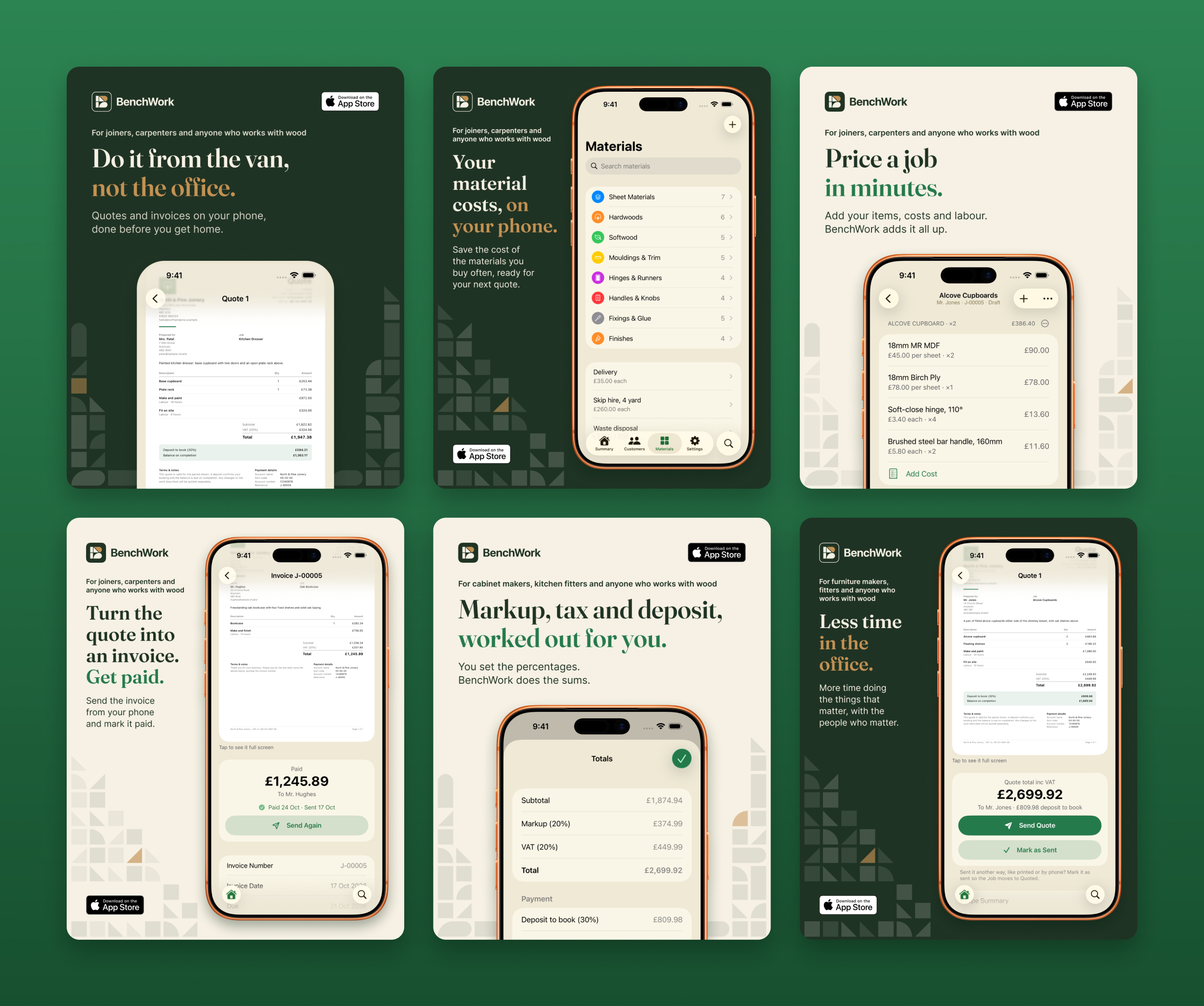
BenchWork was released on the App Store in October 2026. I designed the App Store screenshots around the real screens, alternating green, cream and forest.
Advertising for the trades
Instagram and Facebook adverts with Fraunces headlines, the B pattern from the logo, and a line naming the trades, so the right people stop scrolling.
As the product and UI/UX designer, I took BenchWork from the first idea and information architecture through interaction and interface design and development in Xcode, tested it with a working joiner, and designed the brand: the B monogram, its tile pattern, the App Store screenshots and the adverts.
