ClipDeck
Mac, iPhone and iPad App
Services
Website
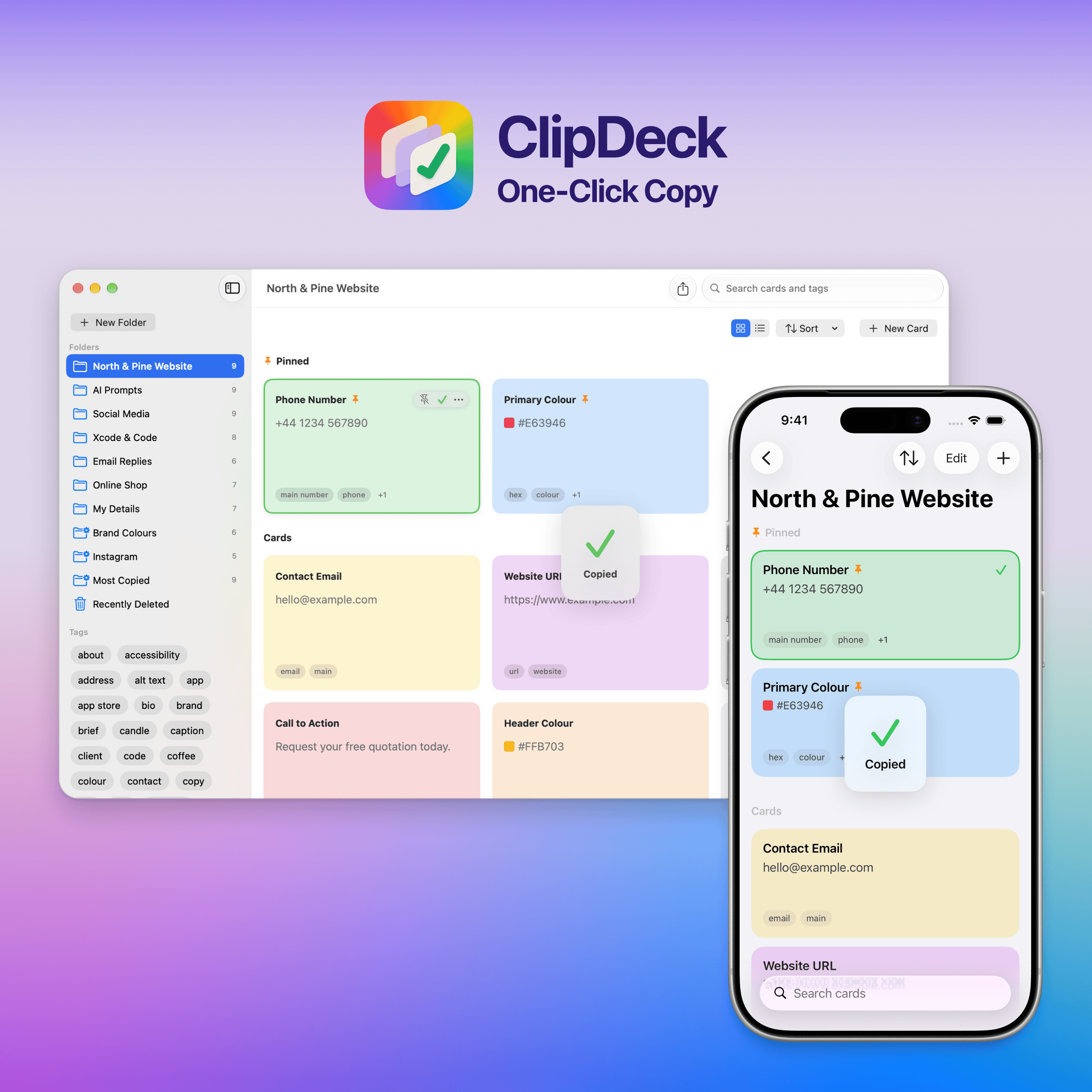
View on the App StoreClipDeck started with my own design work: the hex colours, links and snippets I copied every day were scattered across apps. It keeps them as cards on Mac, iPhone and iPad, and one click copies any of them. This is the long version, with the UI decisions behind it.
The same snippets, scattered everywhere
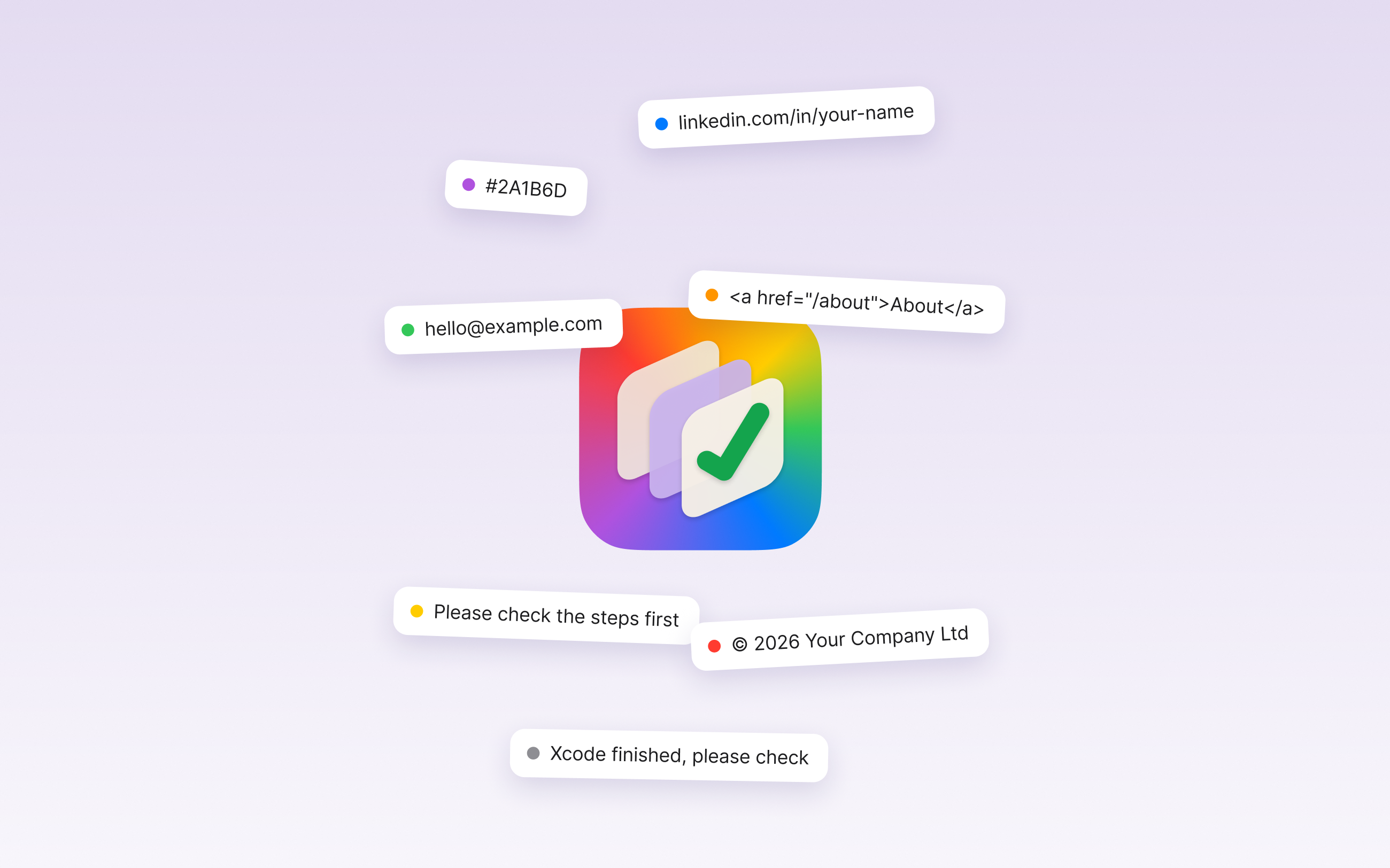
Hex colours, links, contact details, code and AI prompts lived across notes, documents and old emails. Each one was found, highlighted and copied again, many times a day.
ClipDeck keeps them as cards, in folders and tags, on Mac, iPhone and iPad. Click a card and it's on the clipboard.
Designed around one action
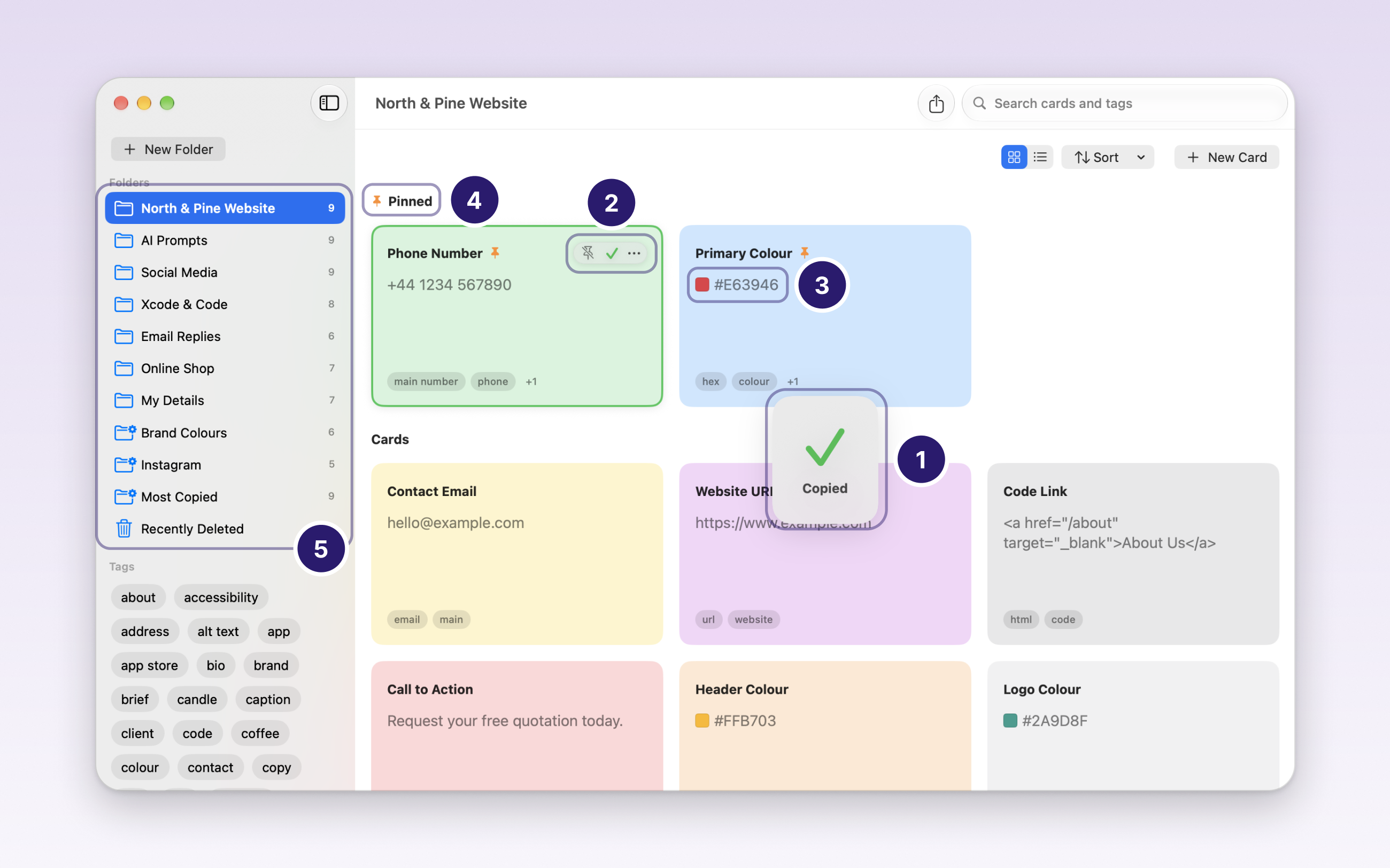
Every decision on the Mac app serves one thing: copying fast, and knowing it worked.
- Instant feedback. The tick appears with no delay, with a Copied pop-up and a green outline. It's doubled up on purpose, so you know it worked.
- Calm cards. Pin, copy and more only appear on hover, so the cards stay easy to scan.
- Apple's own colours. Card colours are the macOS tag colours, so the app feels native.
- Pinned at the top. The cards you use most stay in reach, above everything else.
- Familiar sidebar. Standard Mac folders and tags, with sections that fold away like Notes.
The same library in your pocket
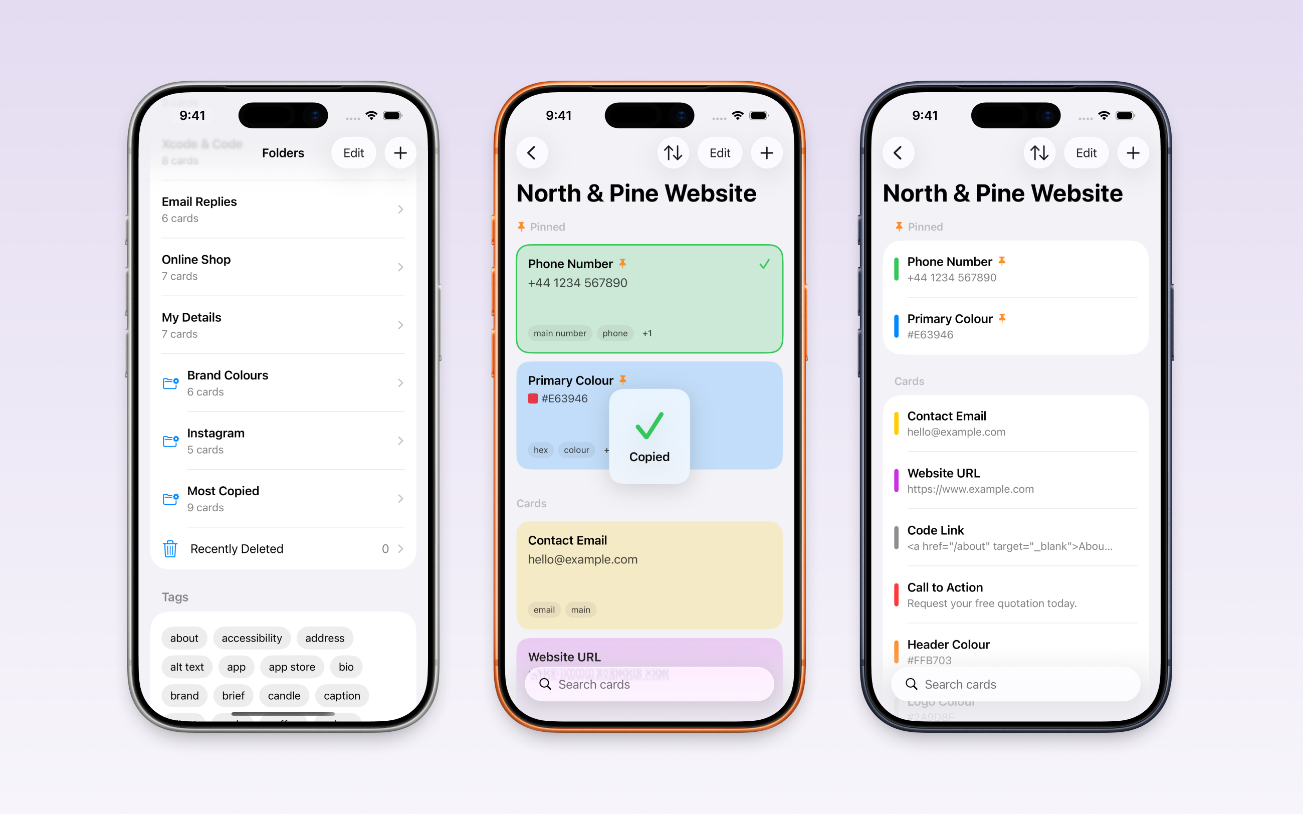
The iPhone and iPad apps share the same cards through iCloud, built for touch: swipe to pin, long-press for more, and a List view for long collections.
A native look, built on Apple's system
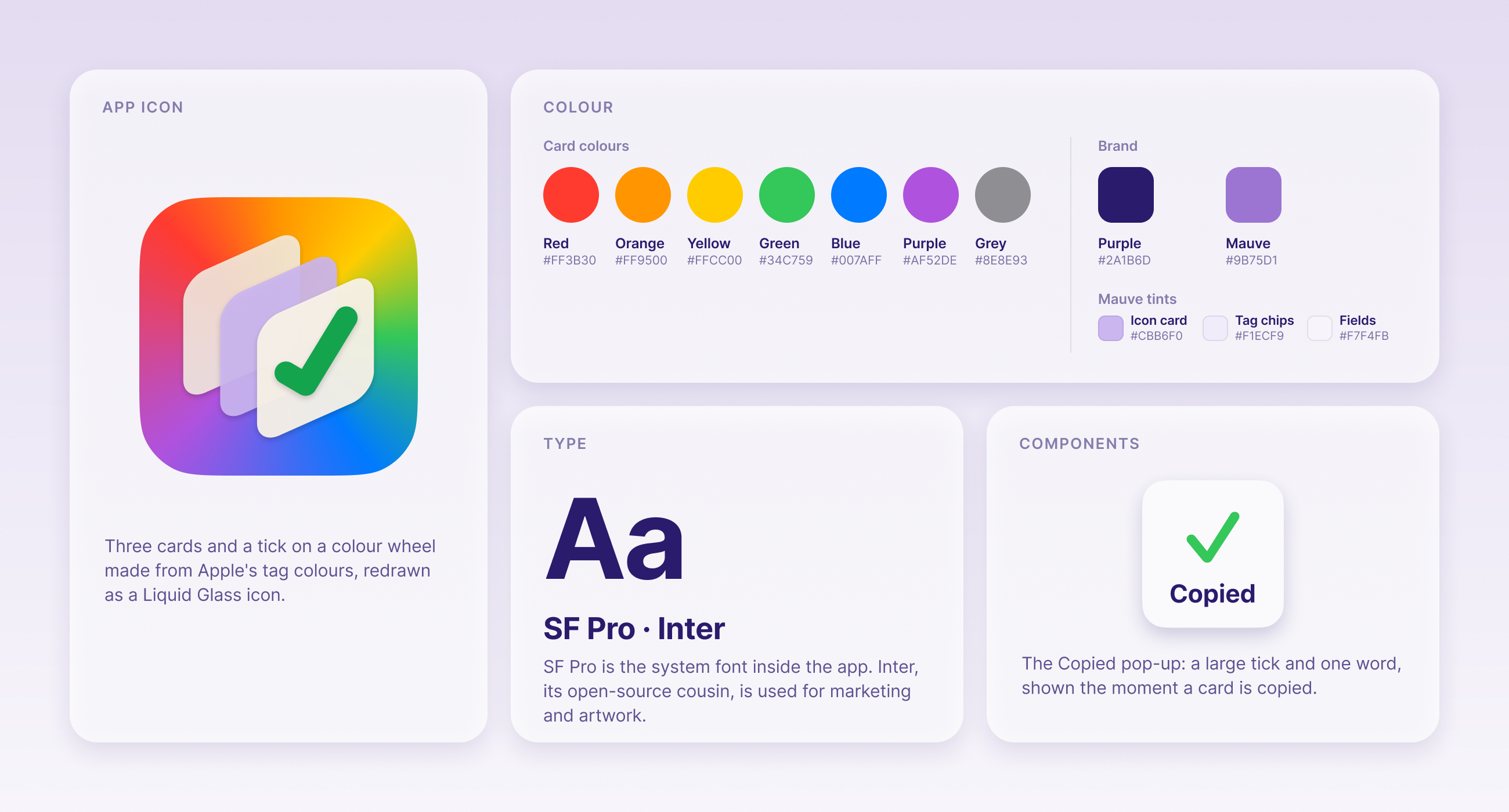
Apple's system font and the macOS tag colours inside the app, with a dark purple and the icon's mauve for the brand.
- App icon: three cards and a tick on a colour wheel made from Apple's tag colours, drawn as a Liquid Glass icon.
- Type: SF Pro, the system font, inside the app. Inter, its open-source cousin, for marketing and artwork.
- Card colours: red #FF3B30, orange #FF9500, yellow #FFCC00, green #34C759, blue #007AFF, purple #AF52DE and grey #8E8E93.
- Brand: purple #2A1B6D and mauve #9B75D1, with three mauve tints for the icon card (#CBB6F0), tag chips (#F1ECF9) and fields (#F7F4FB).
- The Copied pop-up: a large tick and one word, shown the moment a card is copied.
On the App Store
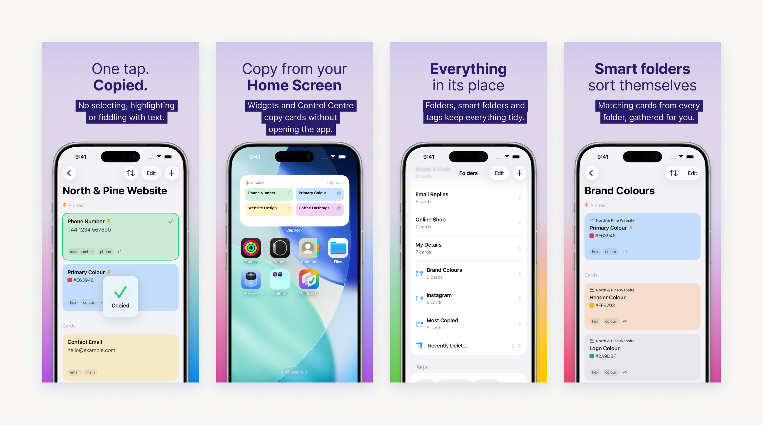
ClipDeck is on the Mac App Store and the App Store. I designed the screenshots too: each headline has a light lead-in and a bold key phrase, over a real screen from the app.
Advertising built around real cards
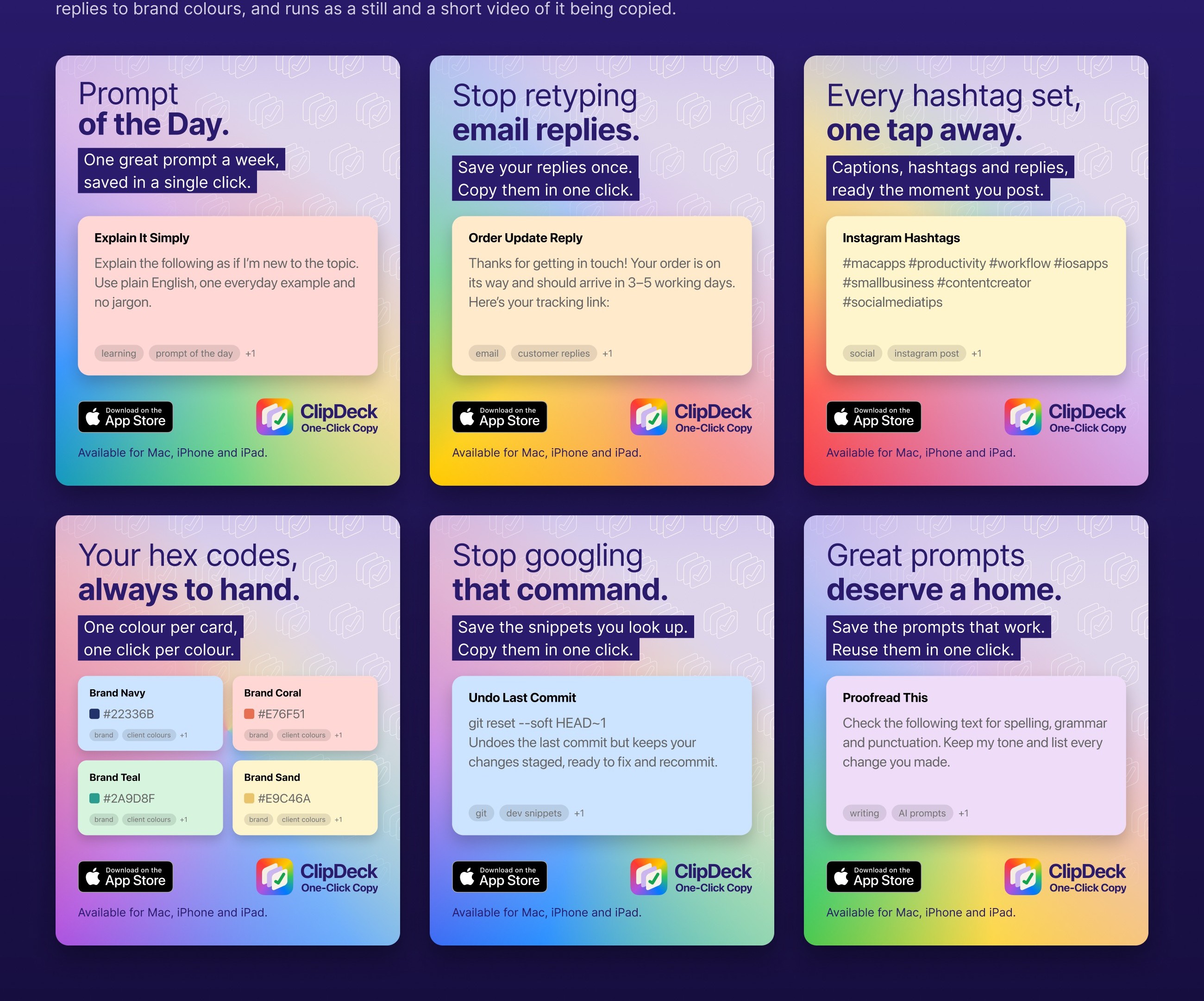
A month of Instagram and Facebook adverts. Each one shows a card people would actually save, from email replies to brand colours, and runs as a still and as a short video of the card being copied.
As the product and UI/UX designer, I took ClipDeck from the first idea and information architecture through interaction and interface design to development in SwiftUI. Building the real app let me test each decision and fix problems as they came up.

